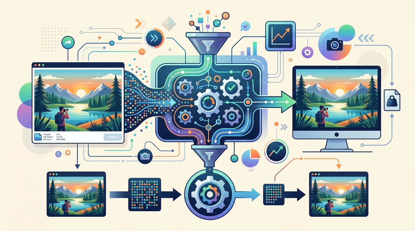
Resize Image Online: Maintain Clarity for Web & Social Media
By Doffl Team · · 8 min read
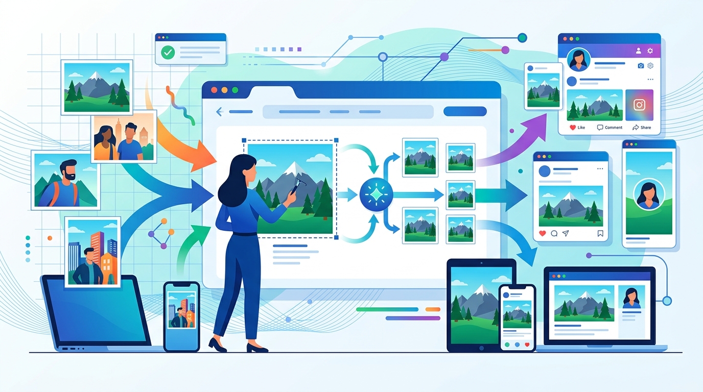
In today's visually driven digital world, high-quality images are non-negotiable. Whether you're running an e-commerce store, managing a blog, or posting on social media, the clarity and loading speed of your images significantly impact user experience and engagement. But how do you achieve that perfect balance of stunning visuals and optimal performance, especially when you need to resize image online? The good news is, it's entirely possible to adjust your image dimensions for various platforms without sacrificing clarity. This comprehensive guide will walk you through the essential concepts, best practices, and practical steps to resize images effectively.
Why Image Resizing Matters for Web and Social Media
Resizing images isn't just about making them fit a specific space; it's a critical aspect of web performance and user experience. Here’s why it's so important:
Improved Website Speed
Large image files are often the biggest culprits behind slow website loading times. When a user visits your site, their browser has to download every element, including images. If these images are unnecessarily large in file size, it dramatically increases the download time. A slow website can lead to:
- Higher bounce rates: Users are impatient. If your site doesn't load within a few seconds, they're likely to leave.
- Lower search engine rankings: Google and other search engines factor page speed into their ranking algorithms. Faster sites generally rank higher.
- Poor user experience: Frustrated users are less likely to engage with your content or make a purchase.
Optimized Social Media Engagement
Each social media platform has its own recommended image dimensions and aspect ratios. Uploading an image that doesn't fit these specifications can lead to:
- Cropping issues: Platforms might automatically crop your images in awkward ways, cutting off important parts of your visual.
- Loss of quality: Images might appear pixelated or blurry if stretched or compressed incorrectly by the platform.
- Suboptimal display: Your content might not look as professional or appealing, reducing engagement rates.
Consistent Brand Presentation
Using correctly sized and optimized images across all your digital channels ensures a consistent and professional brand image. It shows attention to detail and enhances your credibility.
Understanding Key Image Concepts: Size, Resolution, and File Type
Before you dive into resizing, it's helpful to understand the fundamental concepts:
Dimensions (Width and Height)
This refers to the actual width and height of an image in pixels. For example, a common dimension for a blog post image might be 1200px by 800px. When you resize an image, you are primarily changing these pixel dimensions.
Resolution (PPI/DPI)
Resolution is often expressed in Pixels Per Inch (PPI) for digital screens or Dots Per Inch (DPI) for print. For web use, 72 PPI is generally sufficient. Higher PPI values are usually unnecessary and only increase file size without noticeable visual improvement on screens. Focusing on pixel dimensions is more critical for web images.
File Size
This is the amount of storage space an image takes up, typically measured in kilobytes (KB) or megabytes (MB). The goal of optimization is often to reduce file size without compromising visual quality.
File Types
- JPEG (Joint Photographic Experts Group): Best for photographs and complex images with many colors. It uses a lossy compression, meaning some data is discarded to reduce file size. You can control the compression level.
- PNG (Portable Network Graphics): Ideal for images with transparent backgrounds, logos, line art, and images with sharp edges. It uses lossless compression, preserving all data.
- GIF (Graphics Interchange Format): Best for simple animations and images with a limited color palette. Not suitable for high-quality photos.
- WebP: A modern image format developed by Google that offers superior lossless and lossy compression for images on the web. It can often achieve smaller file sizes than JPEGs or PNGs at comparable quality.
Best Practices for Resizing Images Without Losing Clarity
Follow these guidelines to maintain image quality during resizing:
- Always Start with a High-Quality Original: You can always size down an image without significant quality loss, but scaling up a small, low-resolution image will almost always result in a blurry or pixelated mess. Begin with the largest, highest-quality version you have.
- Understand Your Target Dimensions: Know the exact pixel dimensions required for the platform you're uploading to. For instance, a Facebook cover photo has different requirements than an Instagram story.
- Maintain Aspect Ratio: When resizing, always lock the aspect ratio (the proportional relationship between an image's width and height). This prevents your image from appearing stretched or squished. Most online tools have a "lock aspect ratio" or "constrain proportions" option.
- Resample vs. Resize: Some advanced image editors offer different resampling methods. For simple web resizing, bicubic or lanczos resampling usually provides good results, balancing sharpness and smoothness.
- Choose the Right File Format: As discussed, JPEG for photos and PNG for graphics/transparency are generally the go-to. Consider WebP for modern web browsers for even better compression.
- Compress After Resizing: After you've resized your image to the correct dimensions, you can further optimize its file size through compression. Many tools combine resizing and compression, but sometimes a separate compression step (especially for JPEGs) can yield better results.
- Don't Over-Compress: While reducing file size is good, excessive compression (especially with lossy formats like JPEG) can introduce artifacts and noticeable quality degradation. Aim for the smallest file size that still looks visually appealing.
How to Resize Image Online with Doffl's Free Tool
Doffl offers a user-friendly Image Resizer that allows you to quickly adjust image dimensions without hassle. Here's a step-by-step guide:
- Go to the Doffl Image Resizer: Open your web browser and navigate to the Image Resizer tool on Doffl.com.
- Upload Your Image: Click on the "Upload Image" button or simply drag and drop your image file into the designated area. The tool supports common formats like JPEG, PNG, and WebP.
- Enter Desired Dimensions: Once your image is uploaded, you'll see options to enter your desired width and height in pixels. Crucially, ensure the "Maintain Aspect Ratio" (or similar) checkbox is ticked. This prevents distortion.
- Choose Output Format (Optional): If you wish to convert your image to a different format (e.g., from PNG to JPEG for better compression of a photo), select the desired output format.
- Review and Download: The tool will process your image. Once complete, you'll see a preview of the resized image. If you're satisfied, click the "Download" button to save your optimized image to your device.
Practical Example: Resizing for an Instagram Post
Let's say you have a beautiful photograph taken with your phone, and you want to post it on Instagram, which recommends a square aspect ratio (1:1) and dimensions of 1080x1080 pixels for optimal display.
- Upload your original photo to the Image Resizer.
- If your photo isn't already square, you might first use the Image Cropper / Editor to crop it to a 1:1 aspect ratio, focusing on the most important part of the image.
- After cropping (if needed), go back to the Image Resizer.
- Enter
1080in the width field and1080in the height field. Make sure "Maintain Aspect Ratio" is checked (though for 1:1, it will naturally be maintained if both are 1080). - Download your perfectly sized Instagram post.
Common Image Dimensions for Web and Social Media
While specific requirements can change, here are some widely used dimensions to help you plan:
Website Images
- Blog Post Featured Image: 1200px wide (height varies depending on aspect ratio, often 630px for social sharing previews or 800px for a more vertical look).
- Hero Image (Full Width Banner): 1920px wide (height can vary from 400px to 800px or more).
- Product Images (e-commerce): Often 800px to 1200px on the longest side, typically square (e.g., 1000x1000px) for consistency.
- Thumbnails: 150px to 300px square.
Social Media Images
- Facebook:
- Profile Picture: 170x170px (desktop), 128x128px (smartphone)
- Cover Photo: 820x312px (desktop), 640x360px (smartphone)
- Feed Image: 1200x630px (link share), 1200x1200px (square), 1200x1500px (vertical)
- Instagram:
- Profile Picture: 320x320px
- Feed Post (Square): 1080x1080px
- Feed Post (Portrait): 1080x1350px
- Feed Post (Landscape): 1080x566px
- Stories/Reels: 1080x1920px
- LinkedIn:
- Profile Picture: 400x400px
- Background Photo: 1584x396px
- Post Image: 1200x627px
- Twitter (X):
- Profile Photo: 400x400px
- Header Photo: 1500x500px
- In-stream Photo: 1600x900px (max width), ideally 2:1 or 16:9 aspect ratio.
Remember that these are general guidelines. Always check the official documentation for each platform for the most up-to-date recommendations. For planning your social media content, tools like Doffl's Social Media Tag Generator can help you craft engaging captions, but the visuals are equally important!
Advanced Tips for Image Optimization
- Lazy Loading: Implement lazy loading for images on your website. This ensures images only load when they enter the user's viewport, speeding up initial page load times.
- CDNs (Content Delivery Networks): Use a CDN to serve your images. CDNs store copies of your content on servers worldwide, delivering them from the server closest to the user, significantly reducing load times.
- Responsive Images: For websites, use responsive image techniques (e.g.,
srcsetattribute in HTML) to serve different image sizes based on the user's device and screen resolution. This ensures users on smaller screens don't download unnecessarily large images. - Image Compression Tools: Beyond resizing, dedicated image compression tools can further reduce file sizes. Many online tools offer both lossless and lossy compression options. Experiment to find the best balance for your needs.
- Consider WebP: If your audience primarily uses modern browsers, converting your images to WebP can offer substantial file size reductions while maintaining high quality. Doffl's Codecanyon Preview Image Converter can also assist with specific image conversion needs.
Conclusion
Mastering the art of image resizing is a fundamental skill for anyone involved in digital content creation. By understanding the principles of dimensions, resolution, and file types, and by employing best practices, you can ensure your images load quickly and look stunning across all platforms. Tools like Doffl's Image Resizer make this process straightforward and accessible. Start optimizing your visuals today to enhance user experience, improve SEO, and boost engagement.
Ready to give your images the perfect fit? Head over to Doffl's Image Resizer and effortlessly resize your images online without compromising clarity!
Tags: Image Optimization, Web Design, Social Media, Photo Editing, Digital Marketing